Hey there  Based in the Bay Area — open to new roles

I'm Xinyi, a product designer
who makes things that
move metrics & people.

Xinyi — reading among houseplants

Nine years shipping consumer and AI products — from a marketplace you've probably used to a community app I grew from zero to 6M. I like fuzzy problems, honest metrics, and design that's warm enough to want to use. View résumé

CurrentlyProduct Design Manager, Poshmark
Based inSan Francisco Bay Area
FocusAI · Marketplace · Mobile
+26%
Search funnel uplift
Poshmark app redesign · 2024
600%
Faster listing creation
Smart List AI · 2023
6M
Users, zero to six
DecorMatters · 2016 — 2022
01 / Selected work

Three projects, one thesis: design is leverage.

redesign.
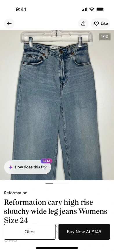
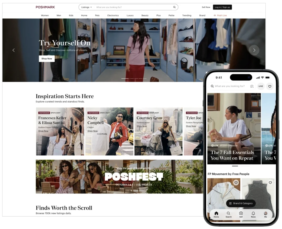
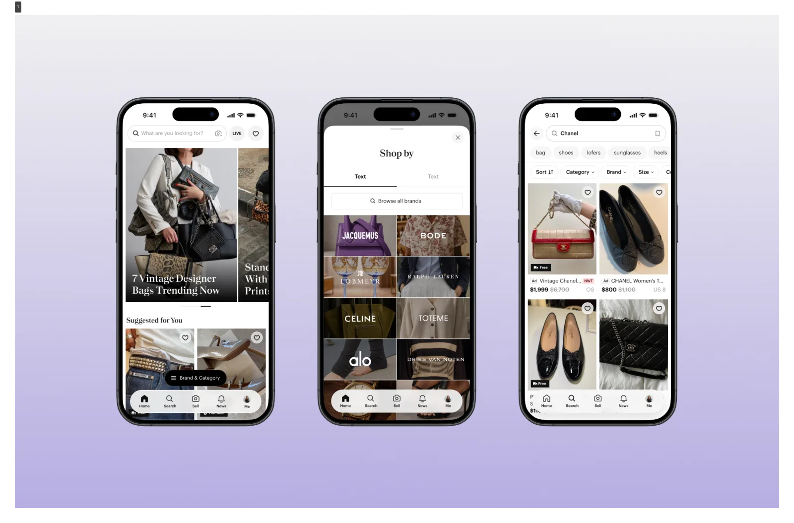
Poshmark redesigned app — three iPhones: home feed, shop by brand, search results
14 months·3 surfaces·60+ screens
Just shipped
View case study
Project 01 / 03
Poshmark · App Redesign

App redesign — home, search & filter

Rebuilt Poshmark's home, search, and filter experience end-to-end. +60% GMV from "For You," stable OI / DAU at launch, and a 60+ screen system migration carried by the highest-intent surfaces.

Smart
List.
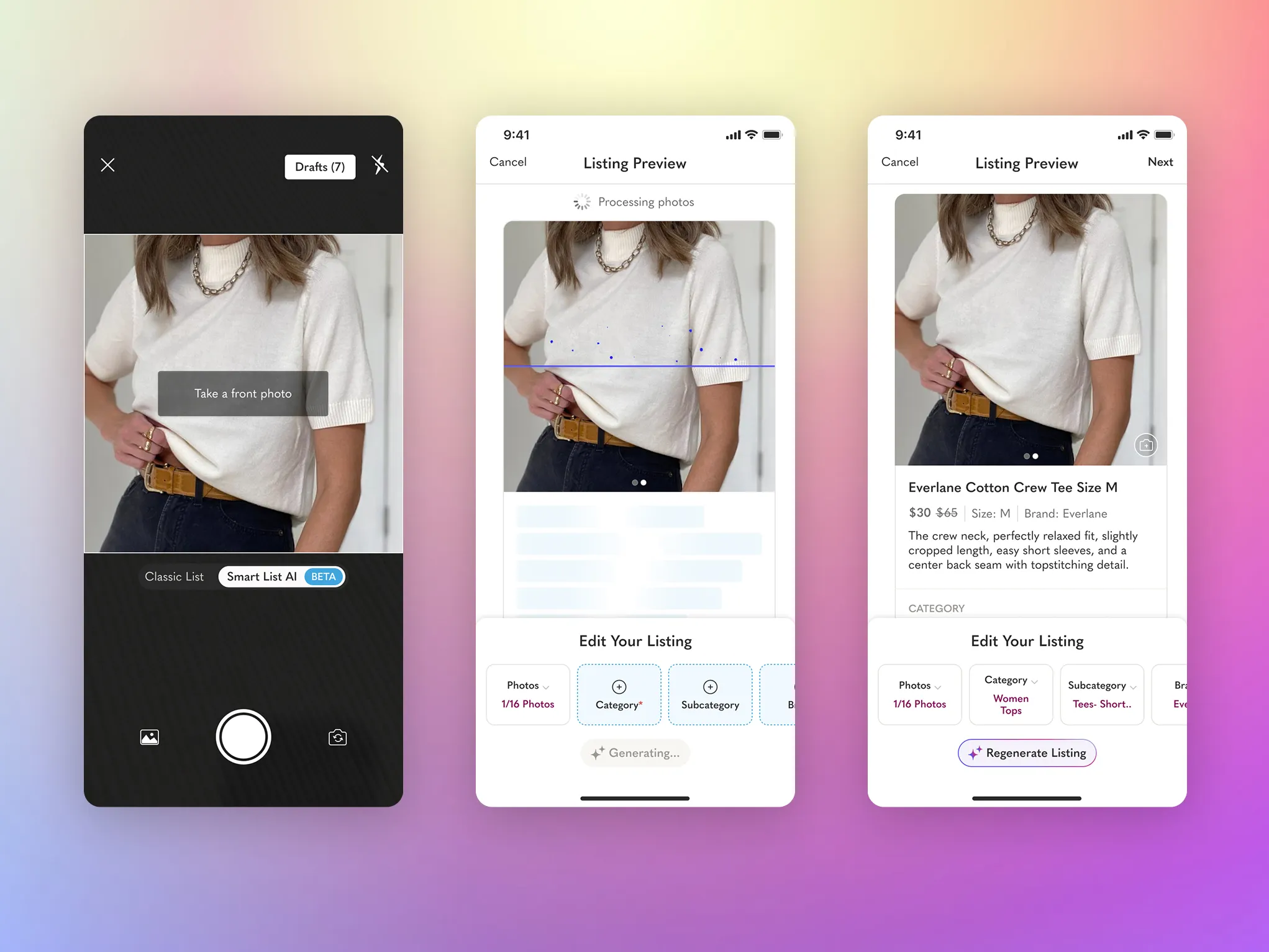
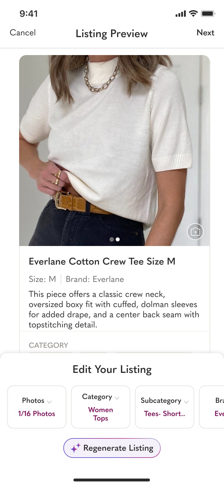
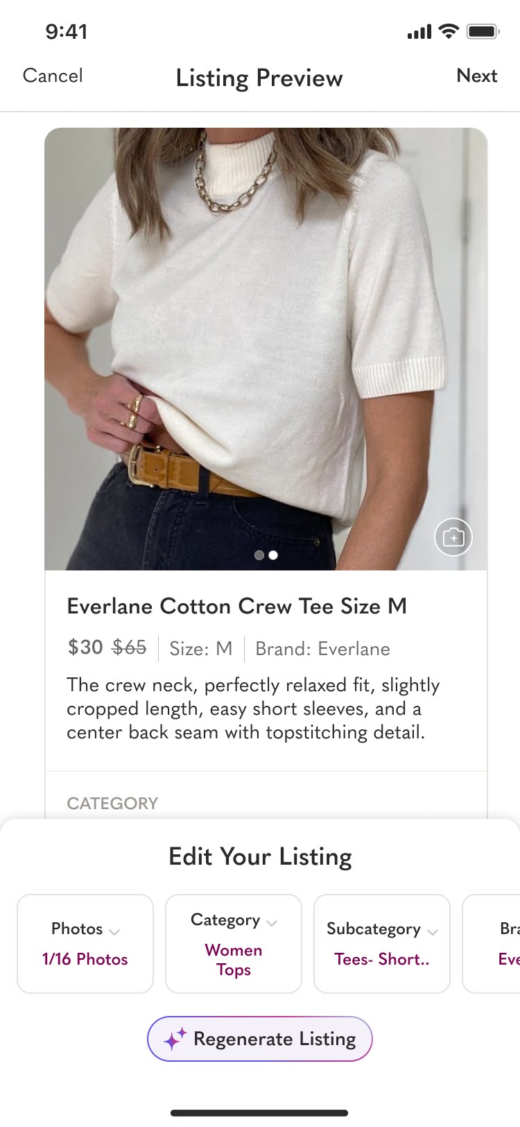
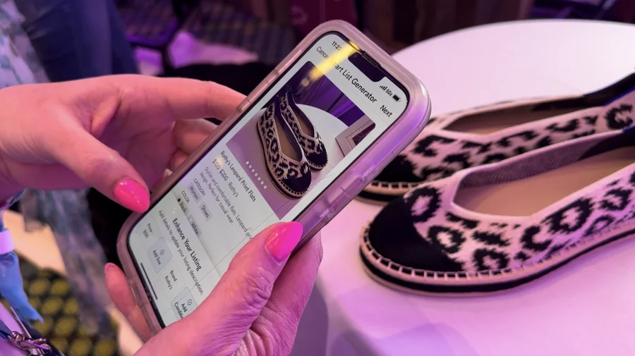
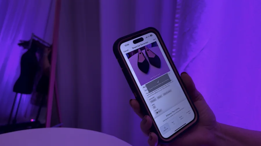
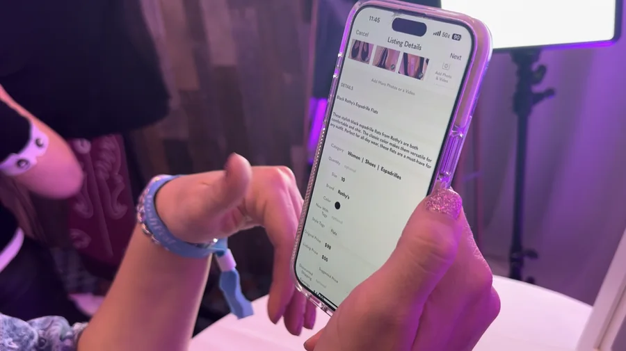
Smart List AI — three iPhone screens: camera with auto-detect, generated listing preview, confidence pills ✨ Drafted by AI
View case study
Project 02 / 03
Poshmark · AI · Seller Tools

Smart List AI — the auto-listing flow

Poshmark's first GenAI feature. Photo in, ready-to-list out — a 15-minute chore collapsed into a 30-second review that sellers actually trust.

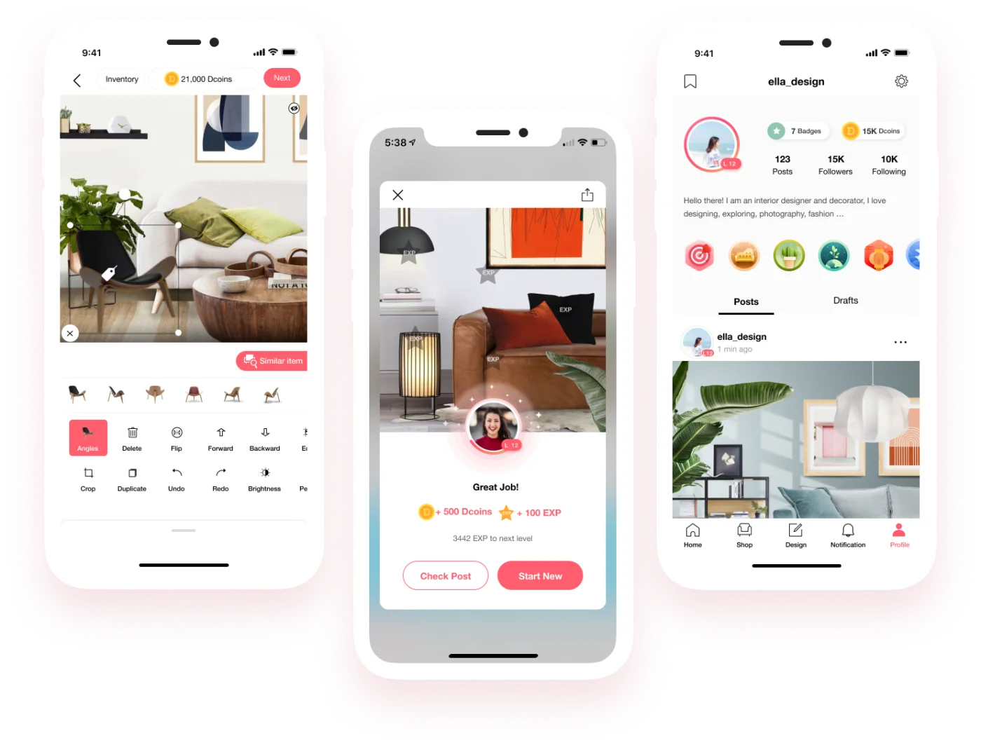
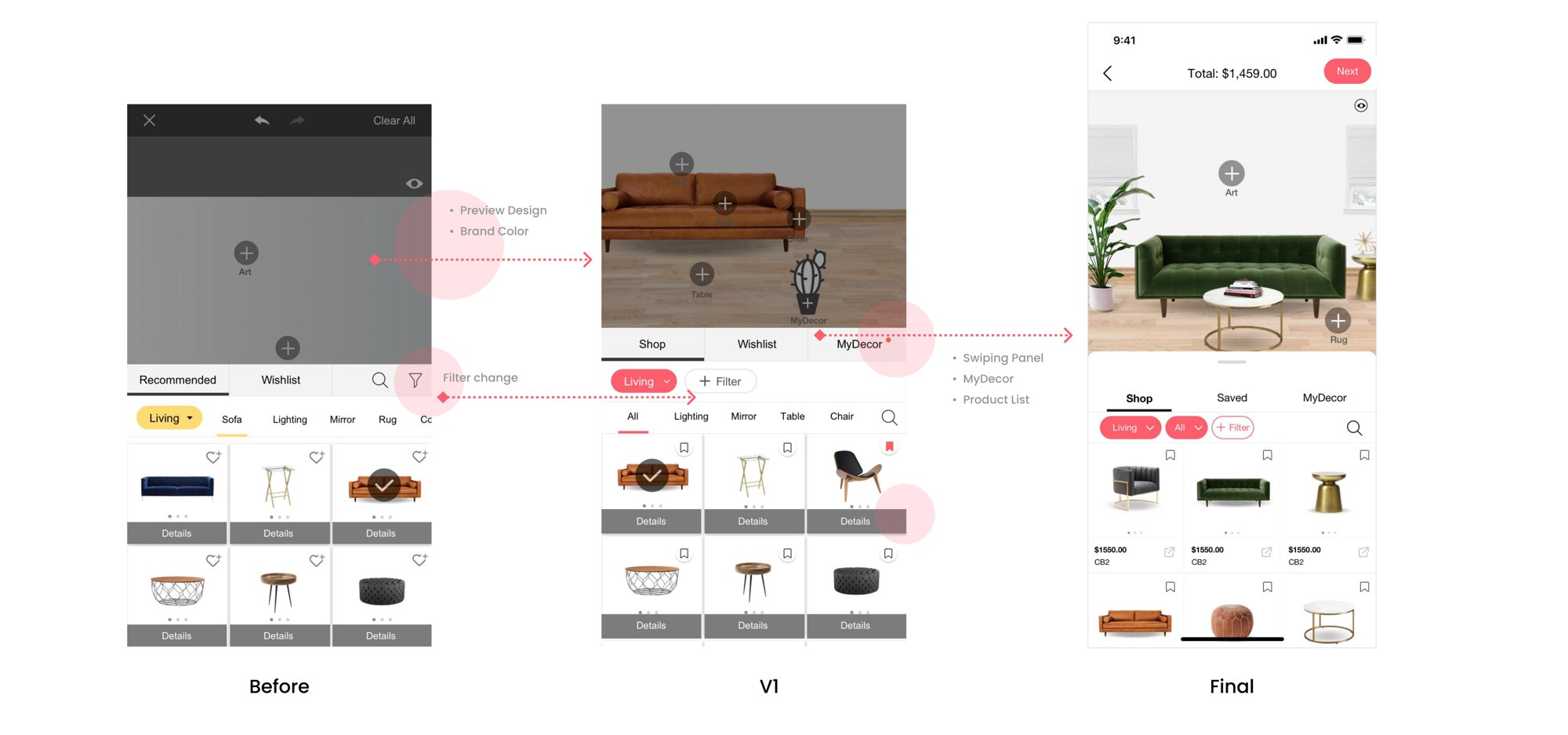
DecorMatters — iPad profile and iPhone design editor on the signature coral circle
0 6M
users.
App of the Day · 4.7★
View case study
Project 03 / 03
DecorMatters · 0→1 · Co-founder

DecorMatters — from 0 to 6M users

Co-founded a consumer design app from zero. Built the product, brand, and creator loop that took DecorMatters from an empty app to 6M users across AR room design, community, and social commerce.

02 / Experience

From 0 → 6M, then scale — here's the timeline.

Mar 2022 — Present
Product Design Manager · Poshmark
Smart List AI · Search & Discovery · For You Feed · Posh Shows · App redesign w/ Naver
Redwood City, CA
Oct 2016 — Mar 2022
Director of UI & UX Design · DecorMatters
0 → 6M users · Apple "App of the Day" · iOS + responsive web · design system
Milpitas, CA
03 / About

On leverage, honest metrics, and designing with care.

A note from me

I'm a Product Design Manager working across consumer, AI, and marketplace products — currently leading design at Poshmark, where I shipped the company's first GenAI feature and led the app redesign that lifted the search funnel by 26%.

Before that, I co-led design at DecorMatters and grew the product from 0 to 6M users, through an Apple "App of the Day" feature and a complete iOS + web redesign. I've done the 0→1, the scale, and the rebuild.

I care about fuzzy problems that don't have clean briefs, work that moves real numbers, and teams that disagree well. I manage designers, run research, write specs, and still push pixels — I think the best design leaders never fully put the pen down.

Outside of work: houseplants, slow reading, and weekend side projects where I get to try things my job doesn't need yet.

9yrs
Consumer · AI · Marketplace
+26%
Search funnel uplift — Poshmark app redesign
6M
Users grown — DecorMatters 0 → 6M
1st
GenAI feature at Poshmark — Smart List AI

Let's make
something considered.
say hello ↗

Based inSan Francisco Bay Area
Open toFull-time · Design Leadership
Back to work
Case Study 01 / AI · Seller Tools

Smart List AI
— the auto-listing flow.

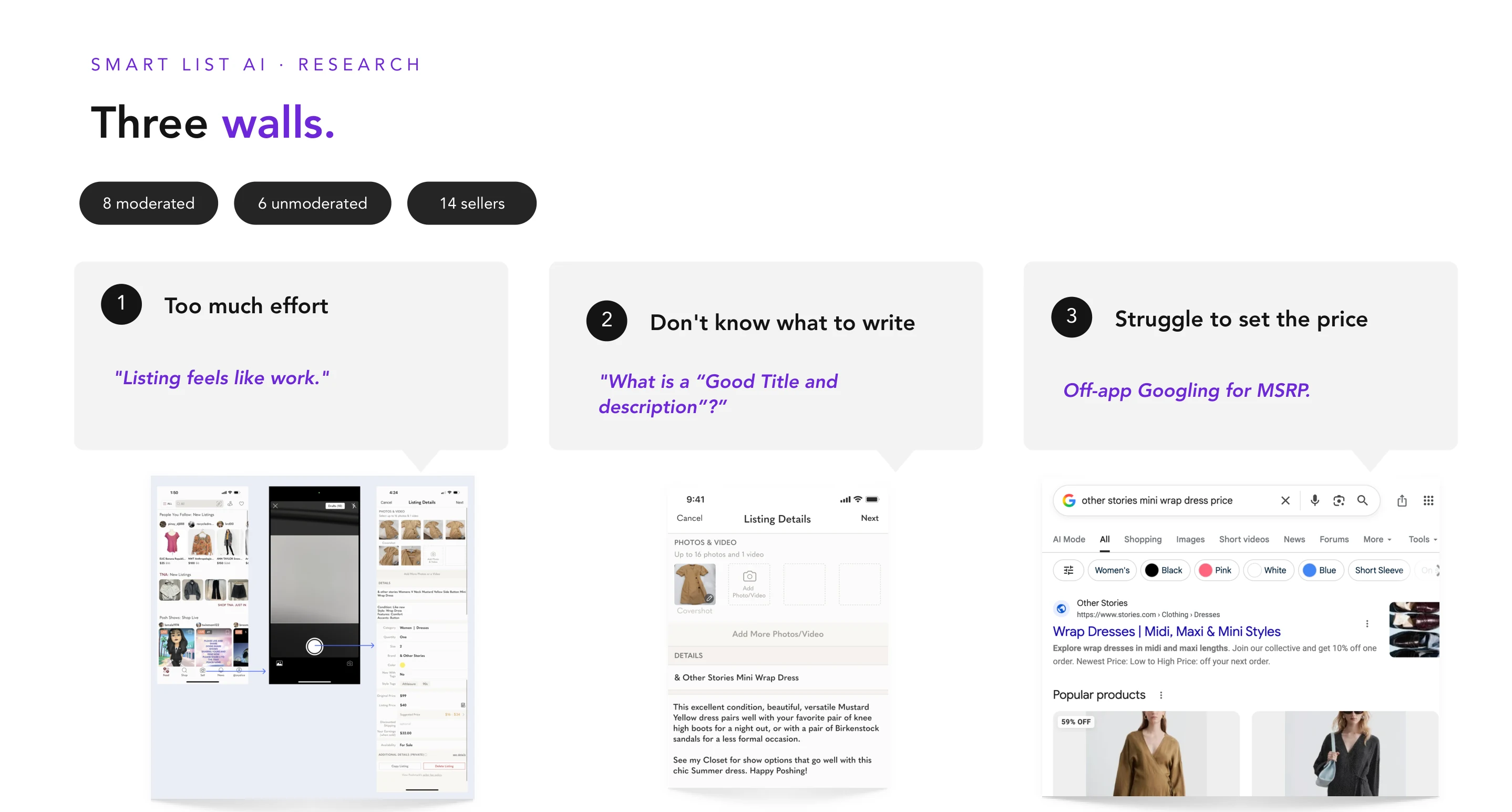
Poshmark's first GenAI-powered feature. We rebuilt the seller's most painful 15-minute flow — create a listing — into a photo-in, ready-to-post-out experience that feels like magic, not autopilot.

Role
Design Lead & PDM
Team
2 Designers · 6 Eng · 2 PM · AI/ML
Timeline
9 months · 2023–2024
Platforms
iOS · Android · Web · mWeb
Photo in
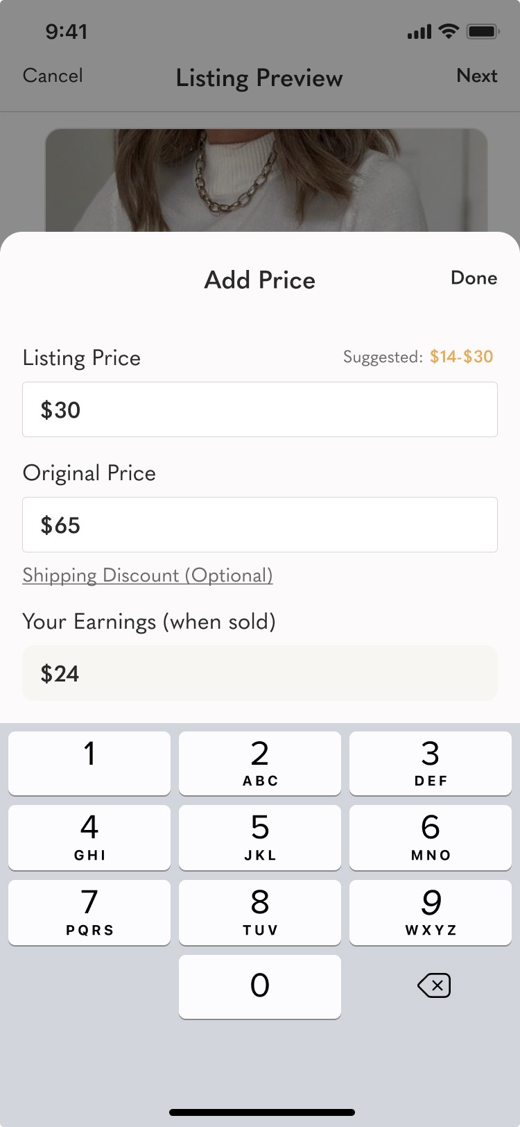
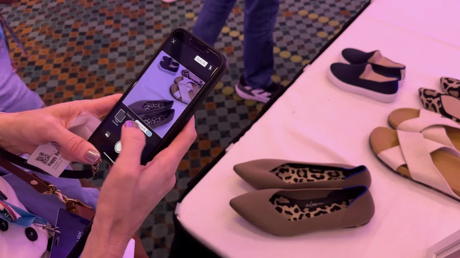
Seller takes one front photo of the garment.
Category is detected from the image and guided photo angles appear — optimized per department, not generic.
Smart List AI — animated walkthrough of the seller flow: camera, photo angles, generated preview, configurator, ready to post
Ready to post
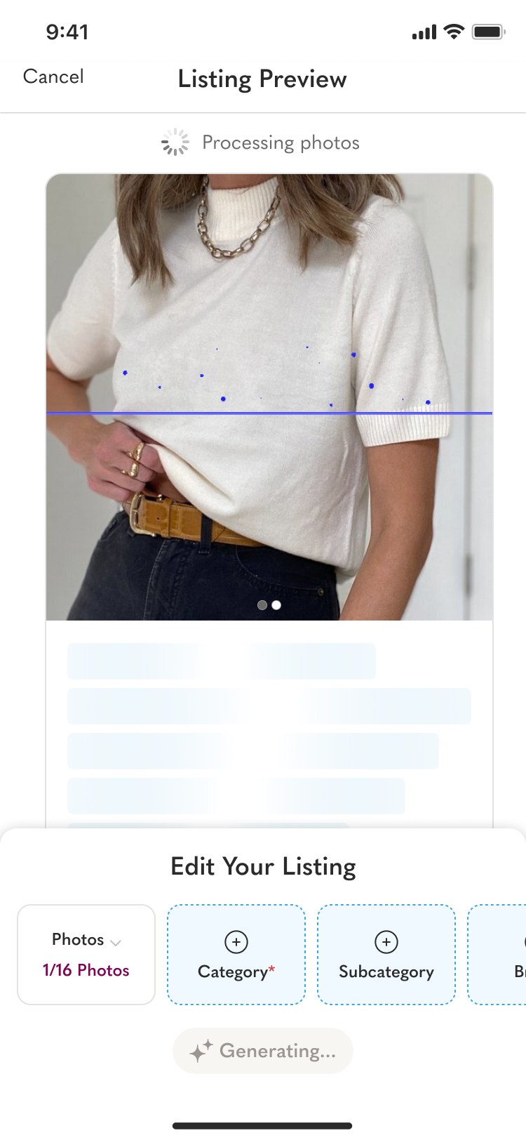
Title, description & attributes drafted automatically.
Seller reviews the draft, taps any field to override, and publishes — the flow everything else hands off into.

TL;DR

Collapsed a 15-minute listing flow into a 30-second review — Poshmark's first shipped GenAI feature.

  • 600% faster listing creation
  • Draft by AI, owned by seller — authorship framing now used across every AI feature on the team
  • Shipped to 100% of sellers on iOS & Android

Context

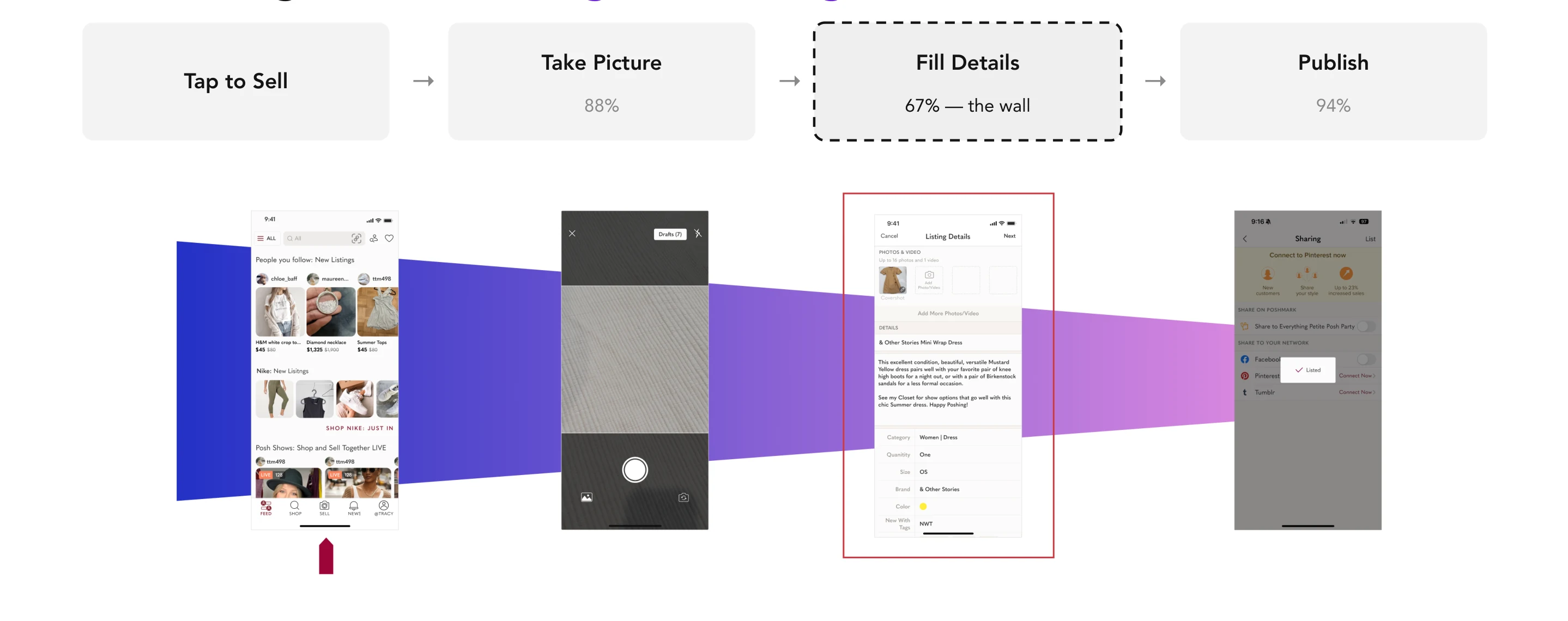
Listing is Poshmark's core creation loop — every item on the marketplace starts here. Seller research showed the median listing took 12–15 minutes across 7+ fields (title, description, category, brand, size, condition, keywords). Sellers abandoned halfway, reused templates that hurt discoverability, and new sellers often gave up before their first listing went live.

Problem

Listing was the tax sellers paid to sell.

Every minute of friction in the create flow translated directly to fewer listings on the platform — and fewer listings means fewer buyers. The funnel leaked at every field, especially for new sellers who had never written a product description before.

Insight

Sellers didn't want autopilot — they wanted a copilot.

Our earliest prototypes auto-filled everything silently, and sellers hated it. They didn't trust a black box to represent their inventory. The breakthrough was reframing AI from "it does the work for you" to "it drafts, you own it." Trust came from authorship, not accuracy.

Strategy

Design for trust before speed.

  • Progressive disclosure of AI confidence per field, so sellers know what to double-check
  • One-tap regenerate and inline edit for every AI-drafted field
  • Explicit "Draft by AI" labels, removing ambiguity about authorship
  • Edge-case handling for blurry photos, multi-item shots, and unknown brands

Solution

Photo in, ready-to-post out.

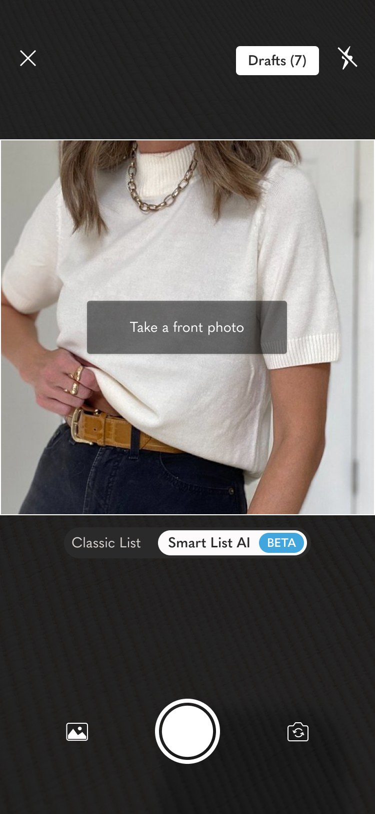
One tap on a photo produces a full draft — title, description, category, brand, condition, keywords — each field showing a confidence indicator. Sellers scan, edit inline, regenerate any field, and post. The entire review takes seconds.

"It's the first time I've felt like the app was working for me, not the other way around." — Top Seller, beta research

A/B test

Shipped to an A/B test — publish rate moved, business metrics stayed flat.

We ran Smart List AI against the standard listing flow across iOS, iPad, Android and web. The feature-level funnel lifted, and the surrounding business metrics (Listers, Sellers, Buyers, Orders, GMV) tracked roughly neutral between control and treatment — the result we were designing toward. No cannibalization, clear feature win.

Listings Published Ratio · daily
Control Treatment
Tap to Sell
Camera
Photos uploaded
Summary viewed
Listing published
Feature funnel
Lister funnel & Listings Published Ratio
Treatment Listings Published Ratio held in the 62–65% band across the test window — a clean lift vs. the 56% baseline the feature was scoped against. Drop-off is concentrated at photo upload, where guided angles are doing the work.
56% → 65%
Listings Published Ratio
Baseline → Treatment (peak)
Neutral
Listers, Sellers, Buyers,
Orders & GMV
4
Platforms tested
iOS · iPad · Android · web

Impact

Goal: lift the listing publish rate. Result: we cleared it.

From day one the success metric was Listings — specifically, the share of seller sessions that result in a published listing. We scoped Smart List AI against a 56% baseline, with a stretch goal of 60% for casual sellers. The A/B test landed well beyond that.

North Star · Listings Published Ratio Goal exceeded
Baseline
before Smart List AI
56%
Target
casual sellers
60%
Treatment
Smart List AI · peak
65%
+9pp vs. baseline
+5pp over the casual-seller target
Neutral GMV & top-line guardrails

Translating the publish-rate lift against Poshmark's overall listing volume, the feature tracks to ~2% incremental listings platform-wide — the exact bar leadership set at kickoff.

Reflection

The biggest design lesson wasn't about AI — it was about authorship. When we over-automated, we eroded the seller's sense of craft. When we underplayed it, we didn't realize the time savings. The sweet spot was giving sellers the feeling of curation with the speed of automation. That framing now guides every AI feature on my team.

Next case study
App redesign — home, search & filter
Back to work
Case Study 02 / App Redesign · Home · Search · Filter

App redesign
home, search & filter.

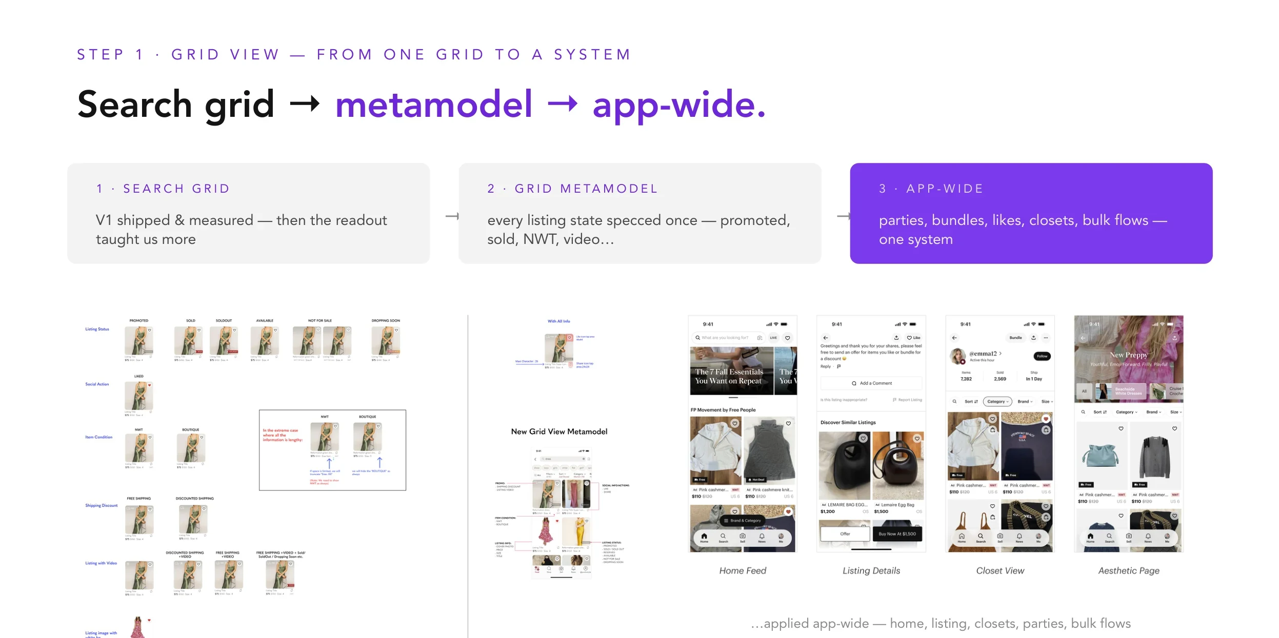
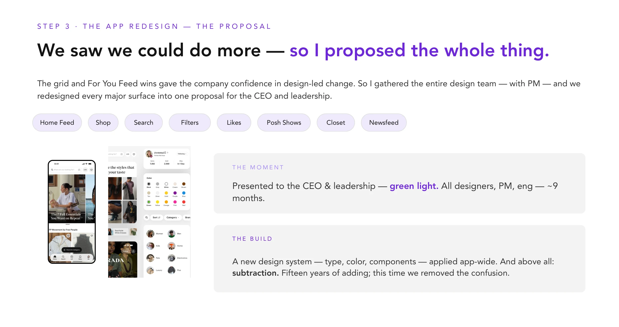
I led design for three of Poshmark's highest-intent surfaces — home, search, and filter — through a 14-month system-wide redesign. We rebuilt home as a ranked discovery engine, modernized search and mobile filters, and carried a 60+ screen system migration.

Role
Design lead · home, search, filter
Team
5 Designers · 10+ Eng · 3 PM · ML · Analytics
Timeline
14 months · 2022 — 2023
Scope
iOS · Android · Web · Design System
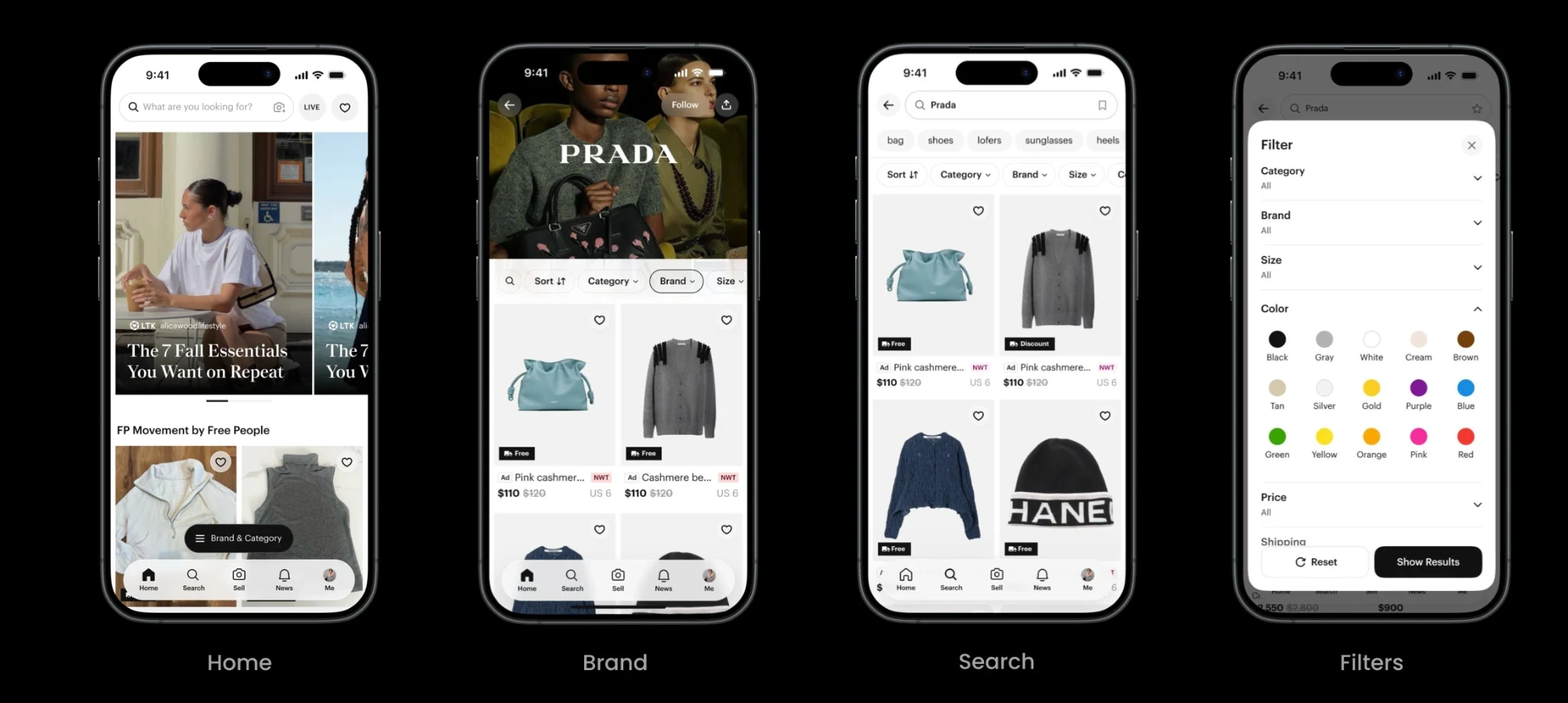
Poshmark app redesign — four iPhone screens showing the new Feed, Lookbook, Collections, and Similar Items flow
Four surfaces of the new discovery flow · Feed → Lookbook → Collections → Similar Items

TL;DR

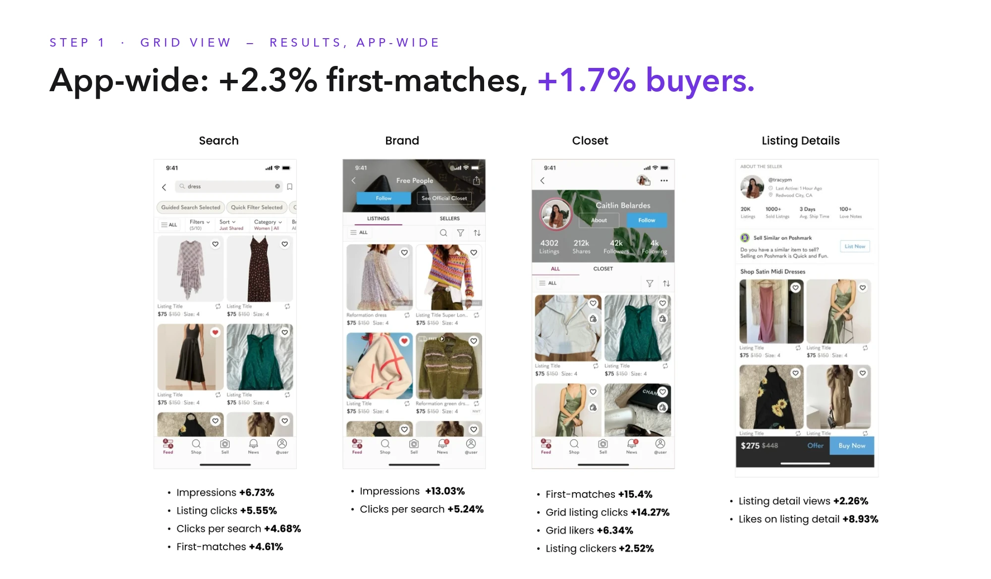
Rebuilt discovery as one ranked spine — core business neutral, everything else moved the way we designed it to.

  • +26% search funnel uplift
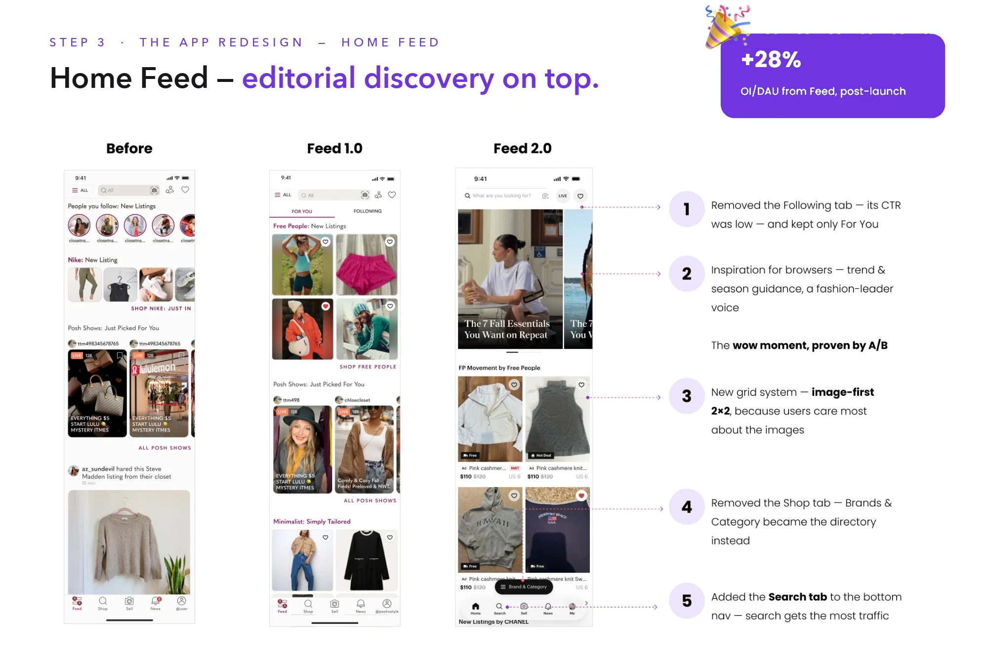
  • +28% OI / DAU from Feed post-launch
  • +12% D1 GMV per new user, +15% D2 retention

Context

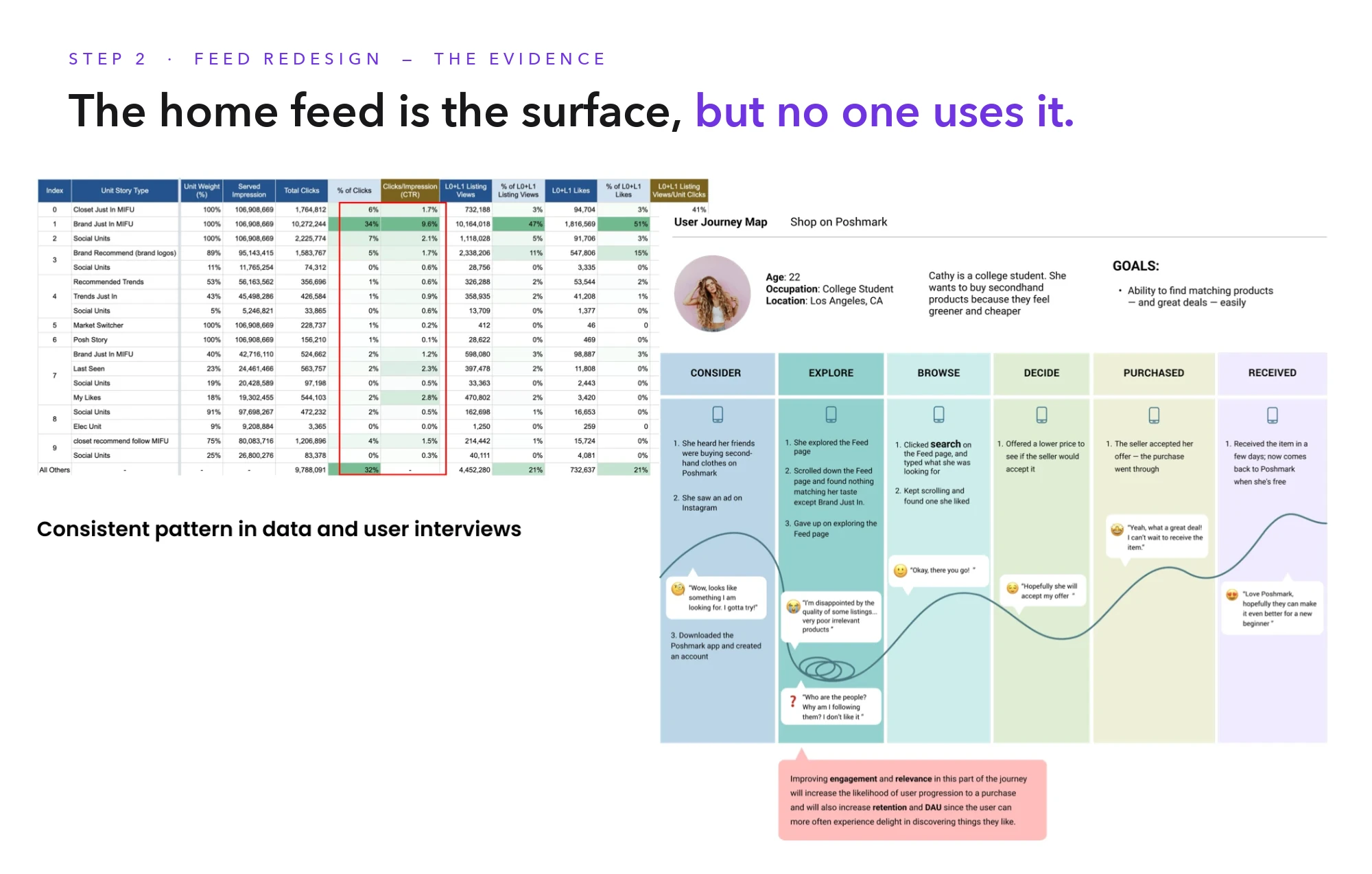
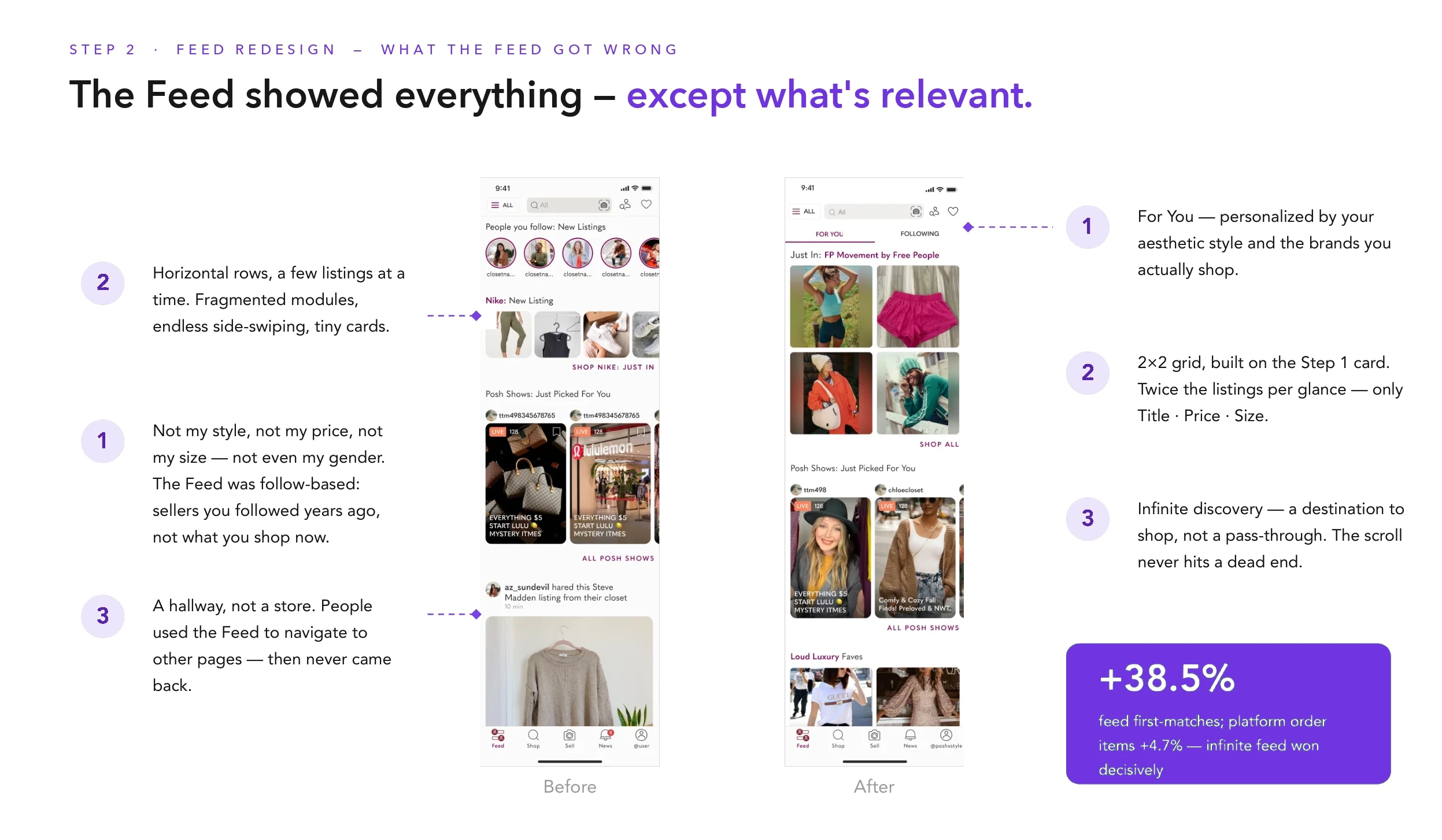
Poshmark's app had grown for a decade on a tab-based browsing model. Home was an inventory wall, Search sat behind a generic Shop tab, and 60+ screens shared a fragmented visual system. Leadership greenlit a full redesign — aligned with a partnership with Naver — and asked three designers to own the highest-intent surfaces. I led home, search, and filter.

Problem

Three surfaces, one outdated mental model.

Home was optimized for browsing inventory, not deciding what to look at next. Search was a business-critical funnel wrapped in dense, web-shaped filter patterns. The design system couldn't support modernization because no single surface carried enough accountability to force migration. Fixing any one in isolation would miss the real problem: discovery needed a single spine.

UX / UI audit

Four patterns the old app was quietly losing on.

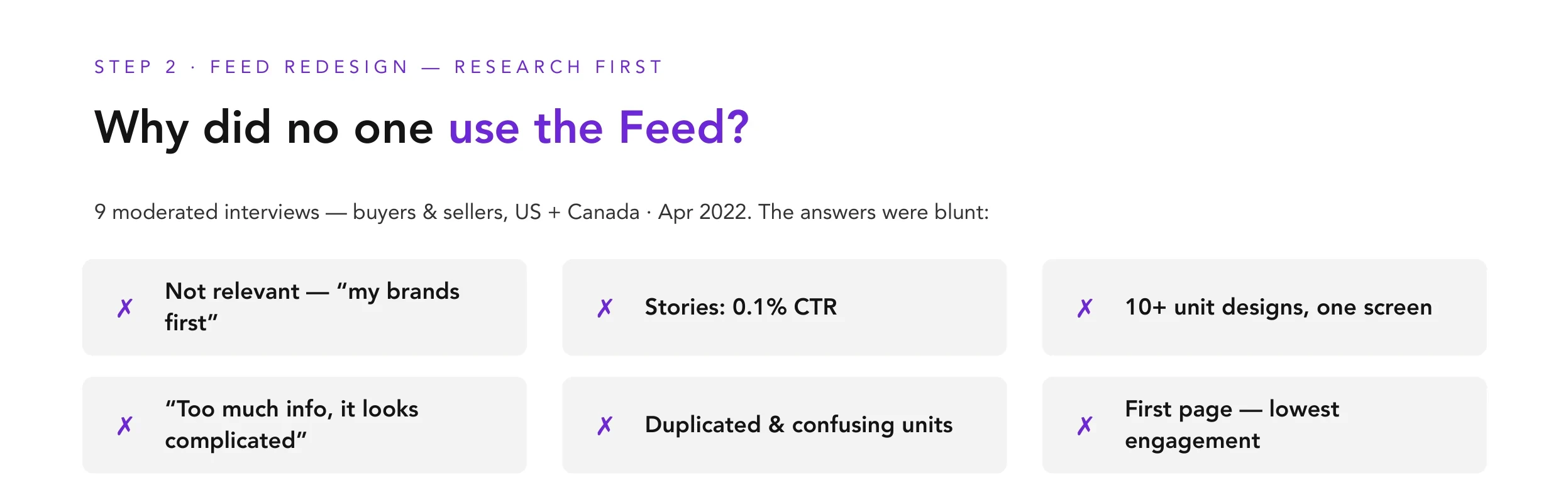
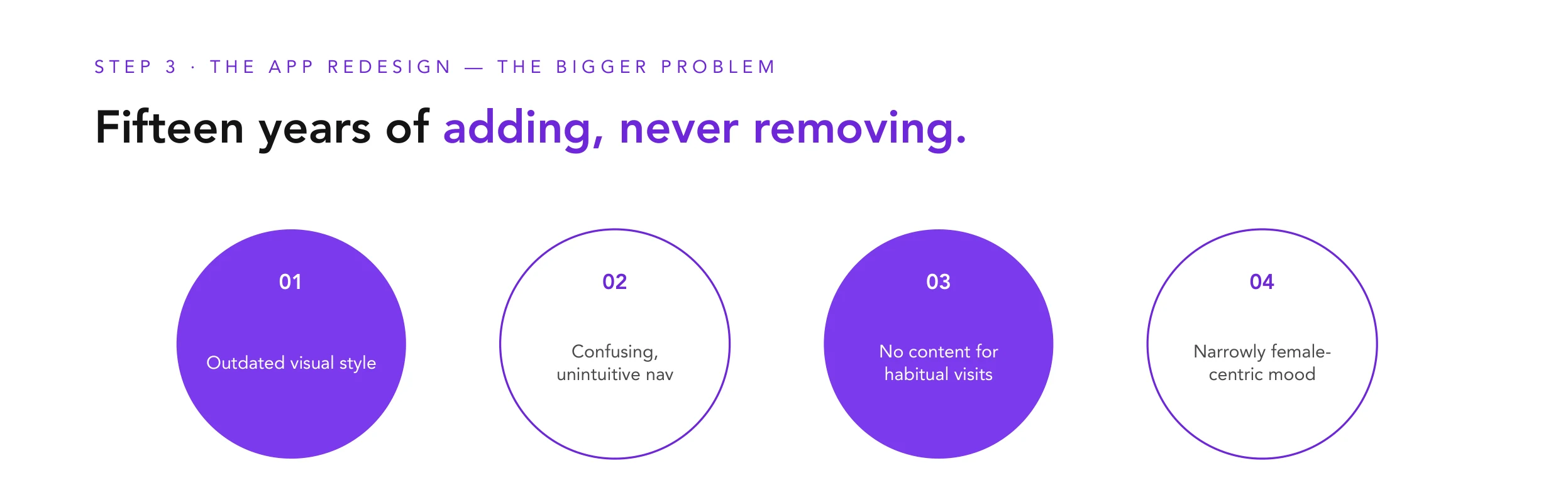
Before rebuilding, we audited the existing app against buyer intent and comparable consumer benchmarks. Four issues kept surfacing — each one solvable in isolation, but together they explained why the app felt dated and why younger audiences bounced.

01 Outdated
visual style
02 Confusing,
unintuitive
navigation
03 No shopping
content to drive
habitual visits
04 Narrowly
female-centric
design mood

Insight

Measure mix-shift, not lift.

Typical redesigns get judged by top-line engagement and quietly fail — traffic moves around inside the app, and nobody can tell signal from regression. We designed against an explicit mix-shift hypothesis: attention should flow into Feed and Search, out of Brand and Community Closet, and OI / DAU should stay neutral overall. Naming the expected losses upfront let us defend the wins.

Direction

The redesign wasn't symmetric — each axis had a target.

Before pixels, we agreed on directional intent. Four axes, each marked from where the app was to where it needed to be. This map became the tie-breaker whenever exploration spread too wide — and made it explicit that we weren't flipping Poshmark's identity, we were re-centering it.

Redesign direction map
As-is To-be
Existing user
First-time user
Previous generation
Gen Z
Functional
Emotional
Feminine
Masculine

Strategy

One ranked spine, three surfaces pulling the same way.

  • Rebuild home as a modular, personalized, ranked feed — not a tab grid
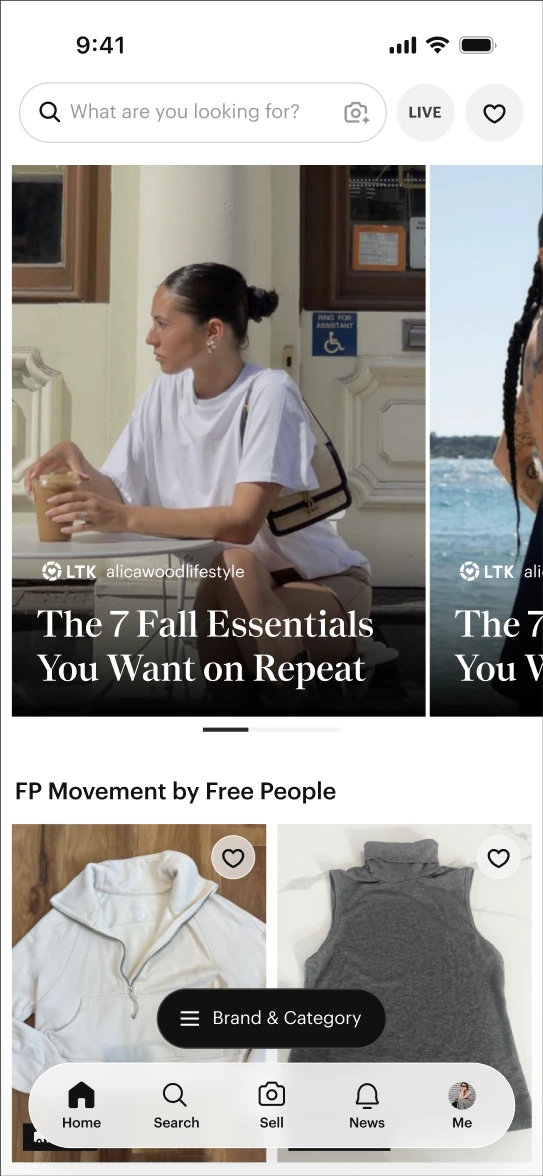
  • Promote Search to a dedicated bottom-nav tab, replacing the legacy Shop tab
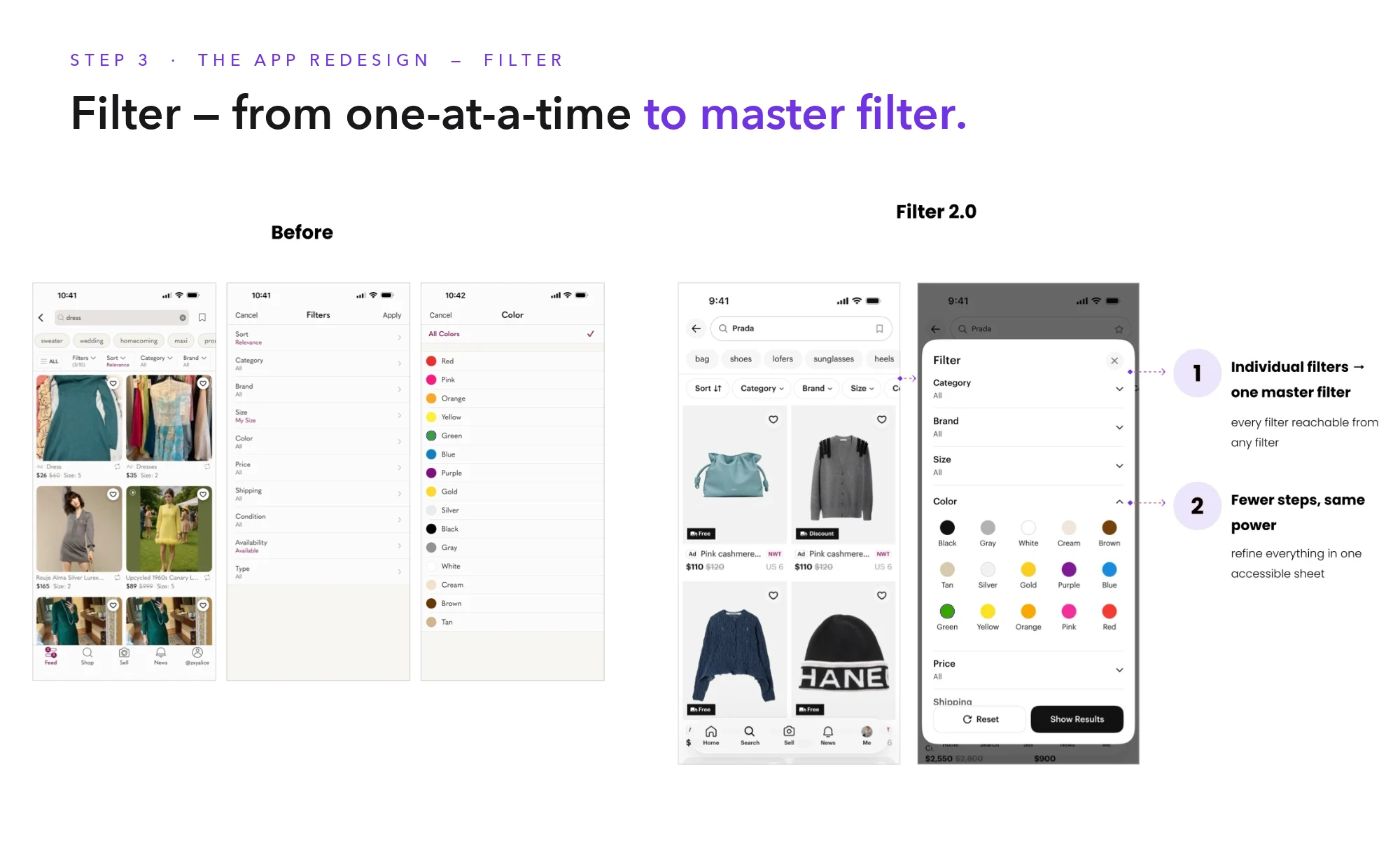
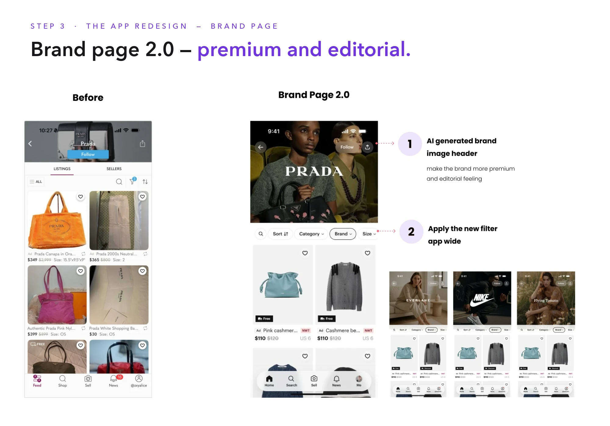
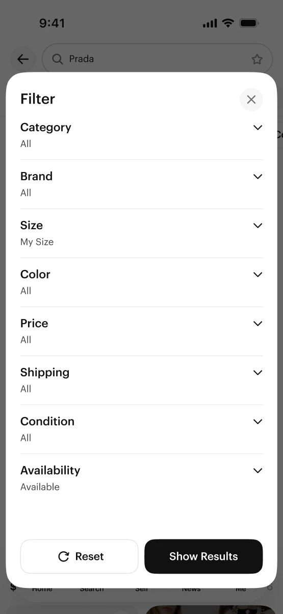
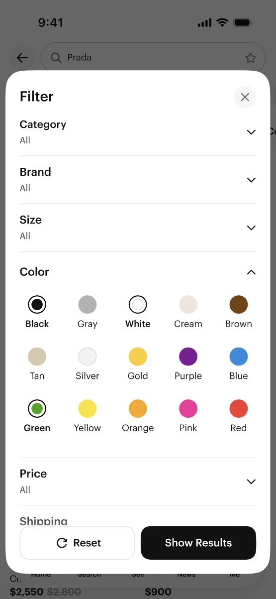
  • Redesign mobile filters into flatter IA with bottom sheets, sticky active filters, query chips
  • Use home + search as the forcing function for a 60+ screen system migration
  • Partner with analytics on a mix-shift measurement framework, not just top-line engagement

Visuals

Switched product imagery to a vertical aspect — the grid finally felt like a fashion app.

Legacy product photos were square, which suited general marketplace inventory but not apparel. Moving every product card to a 4:5 vertical ratio aligned photography with how sellers actually shoot outfits, tightened rhythm across the grid, and gave UGC room to breathe without cropping heads or shoes.

Before · 1:1
After · 4:5
Same photography, re-cropped to vertical — consistent height, better rhythm on the feed and grid.

Feed

Beyond listings — taste-based recommendations and editorial content.

Home stopped being a product wall. It became a ranked, modular feed that mixes personalized product grids with UGC photos and editorial lookbooks — a reason to open the app when you don't already know what you're looking for.

Three unit types, one ranked feed.
Grid view

Recommend highly relevant products based on each shopper's interests and activity history.

UGC photos

Vertical photo ratio, optimized for apparel — full outfit shots, not cropped squares.

Editorial lookbooks

Auto-scrolling carousels curated by theme, giving the feed a rhythm beyond product tiles.

New Poshmark feed — mix of product grid, UGC, and lookbook units on iPhone

Lookbook flow

From a feed tile to a similar-items grid — in three taps.

Stylish, curated lookbooks make it easier to understand fashion and enjoy shopping.
Lookbook flow — four iPhone screens showing Feed, Feed→Lookbook, Lookbook→Collections, Collections→Similar Items

Solution

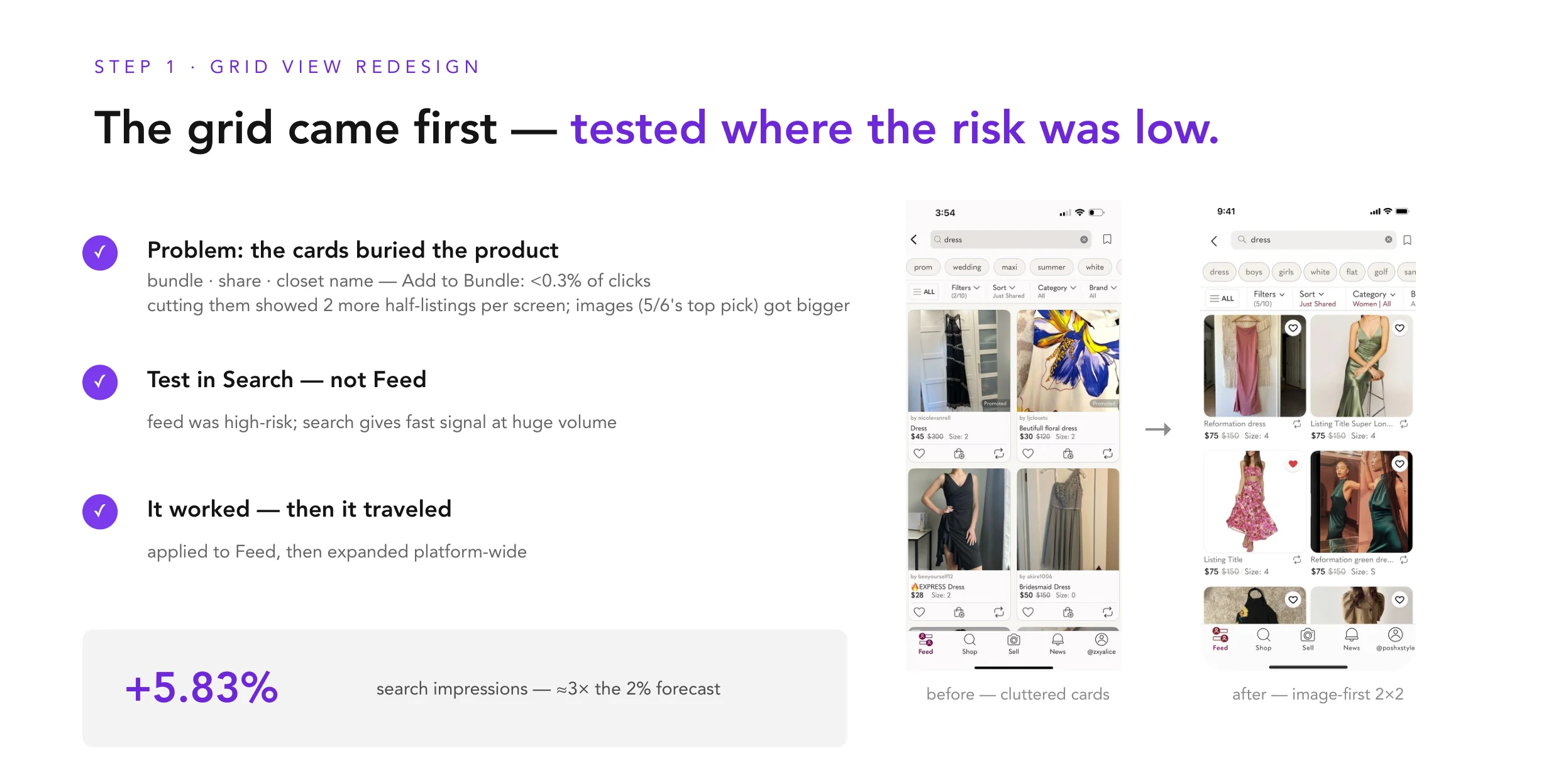
A denser legacy grid → a calmer, more scannable search.

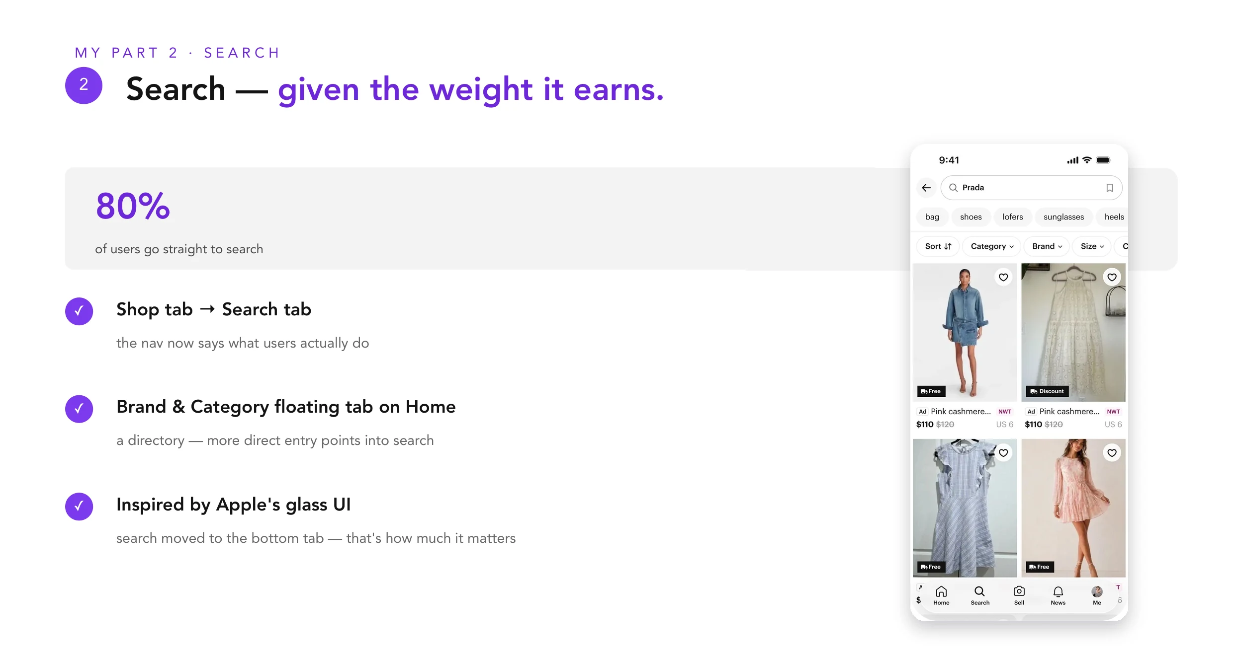
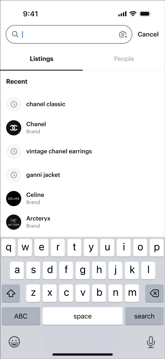
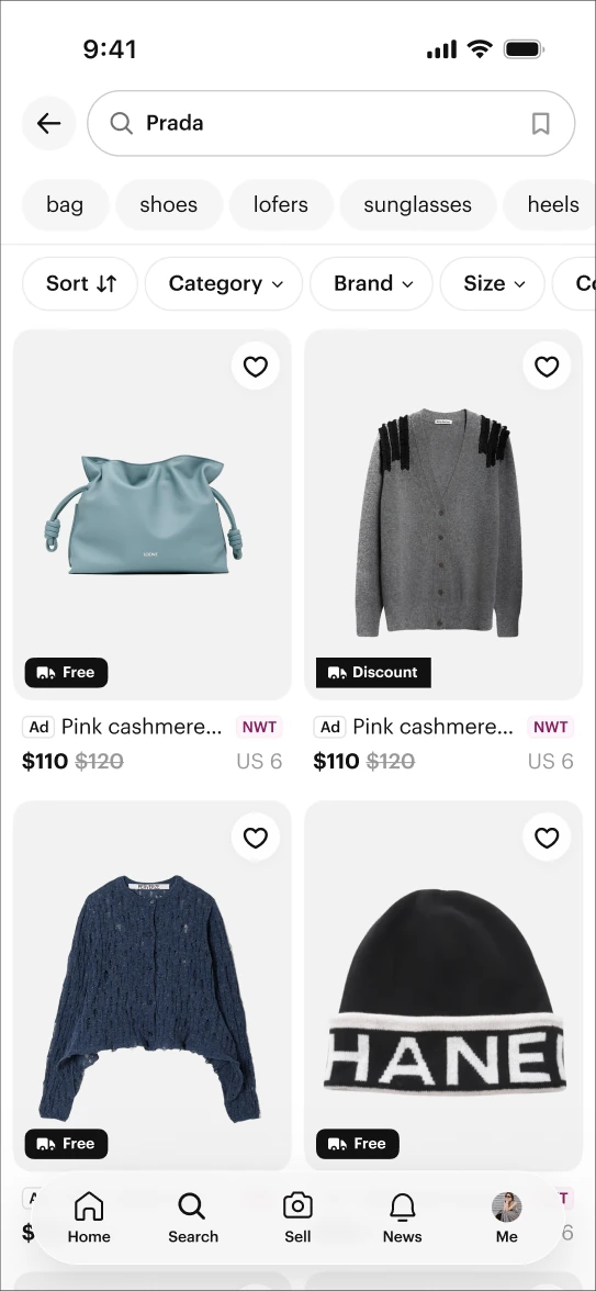
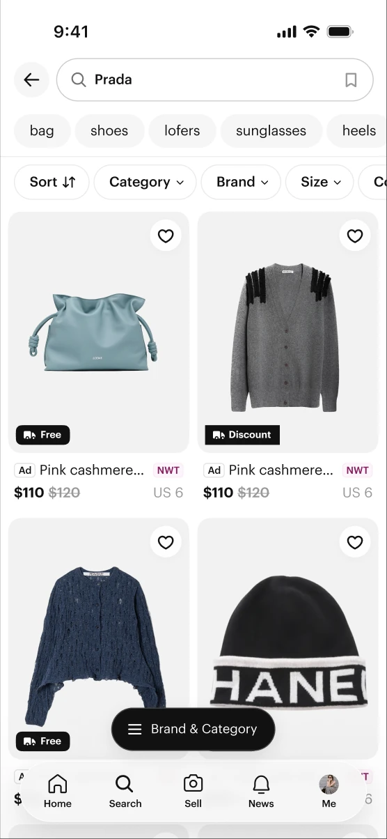
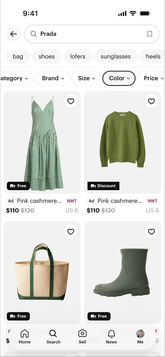
The old search stacked filters, chips, ad labels, and a 2-column grid into a single dense screen. The new surface breathes: search moves to its own bottom-nav tab, filter chips become horizontally scrollable pills, product cards lead with imagery, and meta drops to a second line. Home became a ranked feed of modular units — product, creator, live, show — and mobile filters collapsed into a flatter bottom-sheet IA.

Poshmark search — before and after the redesign: legacy dense grid vs. new scannable layout
Before (left) vs. after (right) · search results, filter chips & bottom navigation

Impact

Neutral on the business baseline, positive on almost everything else.

+0.1%
OI / DAU — neutral at launch (goal met)
+28%
OI / DAU from Feed, post-launch
+12%
D1 GMV per new user

Attention moved where the design pointed it.

Feed
+6.9%
Search
+1.3%
Community closet
−8.4%
Brand
−23.6%

Page View / DAU mix-shift. Neon = intentional gains. Dashed = expected losses from removing the Shop tab.

Order initiated (OI) share by surface — pre vs. post redesign
SurfacePrePostΔ
Feed5.6%7.2%+1.6 pp
Search44.3%45.4%+1.2 pp
Brand10.9%9.7%−1.2 pp
Show15.3%14.6%−0.7 pp

Feed's +9% OI/FM was the bigger signal than traffic: buyers didn't just visit more, they bought more of what they saw. New-user metrics moved up across the board — D2 retention +15%, D1 sessions +10%, D1 buyer +9%. Ad revenue still grew +2.6% overall despite Brand losing top-of-funnel.

Reflection

This project reset how I think about product design. The job wasn't to "improve home" or "redesign search" in isolation — it was to decide where attention should flow across the marketplace, and to defend that decision with a measurement framework explicit enough to tell mix-shift apart from regression. Design systems rarely win on abstraction alone; attaching the 60+ screen migration to surfaces with real traffic made it impossible to ignore.

Next case study
DecorMatters — 0 to 6M users
Back to work
Case Study 03  ·  DecorMatters  ·  Co-founder, 2016 — 2021
A five-year story in three acts.

From an empty app icon
to six million people
designing their real rooms.

I co-founded DecorMatters and led design from zero. We shipped, we were wrong, we pivoted — twice. Each pivot was a design problem I ran end-to-end: insight, research, system, launch. This is the story of how the product became what it was always trying to be.

Role
Co-founder · Head of Design
Team
0 → 20 · design team of 4
Scope
iOS · AR · Community · Gaming · Brand
Timeline
2016 — 2021 · five years
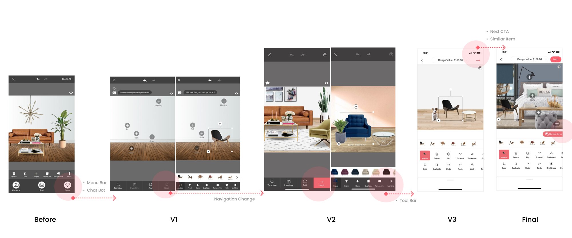
DecorMatters — three iPhone screens showing design editor, AR mode, and profile DecorMatters app icon
App Store
App of the Day
Rating
4.7
Ranked
#35 Lifestyle
Reach
6M
Users across 150+ countries.
From an empty app icon in 2016 to six million designing rooms by 2021.
Craft
4.7
App of the Day · App Store.
Apple editorial feature across five markets; ranked #35 Lifestyle at peak.
Business
×6
Revenue after the 2nd pivot.
Goal was 2×. We hit 6× by treating design as a game economy, not retail.

The arc

Three products, one app icon.

DecorMatters shipped three times. Each version answered a different question, each pivot was a design call I made with the data in hand. Here's the timeline — then three chapters, one per pivot.

2017
V1.0 Launch
AR furniture shopping
2018
1st Pivot
Shopping → community
Oct 2019
3M users
V4.0 · creator loop live
2020
2nd Pivot
Community → gaming
Oct 2021
6M users
Revenue ×6, rewards live
Chapter II.

We built a shopping app. No one came to shop.

2017. AR on iOS was brand new. Our thesis: people don't buy furniture online because they can't tell if it fits. Drop a real chair into a real room, hit buy. Simple.

A year of optimizing · the funnel told a different story
Find inspiration39%
Check furniture details19%
Visualize in AR10%
Transaction0.9%
Conversion topped out at 0.9%. Users weren't shopping — they were designing, then leaving before checkout. The returning segment wasn't a buyer.
"

I don't come here to shop. I come here to design my dream rooms when I'm bored.

Amanda · returning user, 80% female segment, Intercom interview #12

The call

The returning user was 25–55, mostly female, coming back 3–5 times a week to create, not buy. We didn't need a better catalog. We needed a design tool, a social feed, and something to do with free time. Pivot.

Before · 2017
Furniture
shopping app
Shop-first flow · AR-for-purchase · catalog UI · 0.9% conversion
After · 2018 — 1st pivot
Interior design
community
Design-first flow · publish feed · creator-led growth · zero paywall
Chapter IIII.

People were designing. Almost no one was publishing.

After the first pivot, design was the loop. But without publishing there was no feed, no likes, no reason to return. The number that mattered was stuck at 3.5%.

3.5%
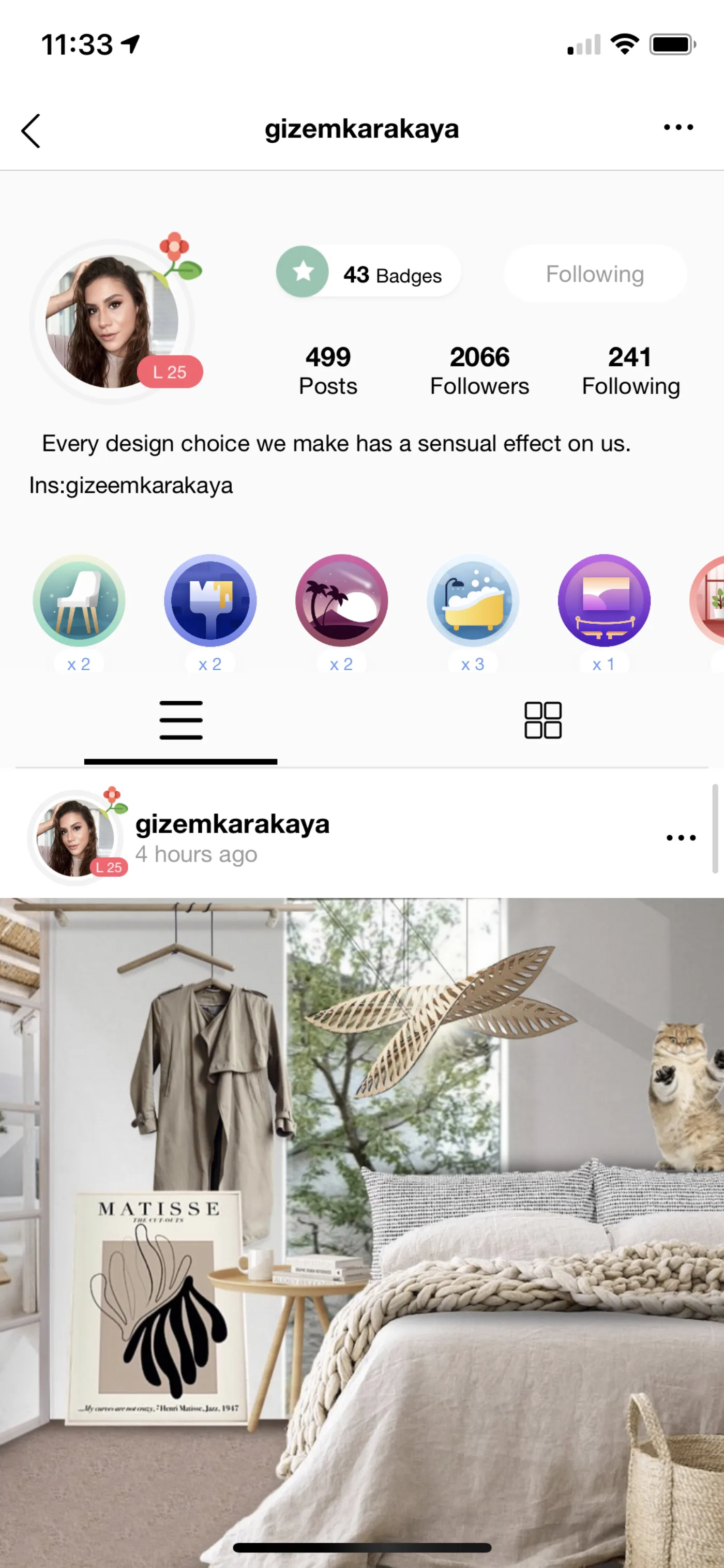
of finished designs ever made it to the feed. The community had no oxygen — and no oxygen meant no growth.
Research
40+ interviews, two groups.
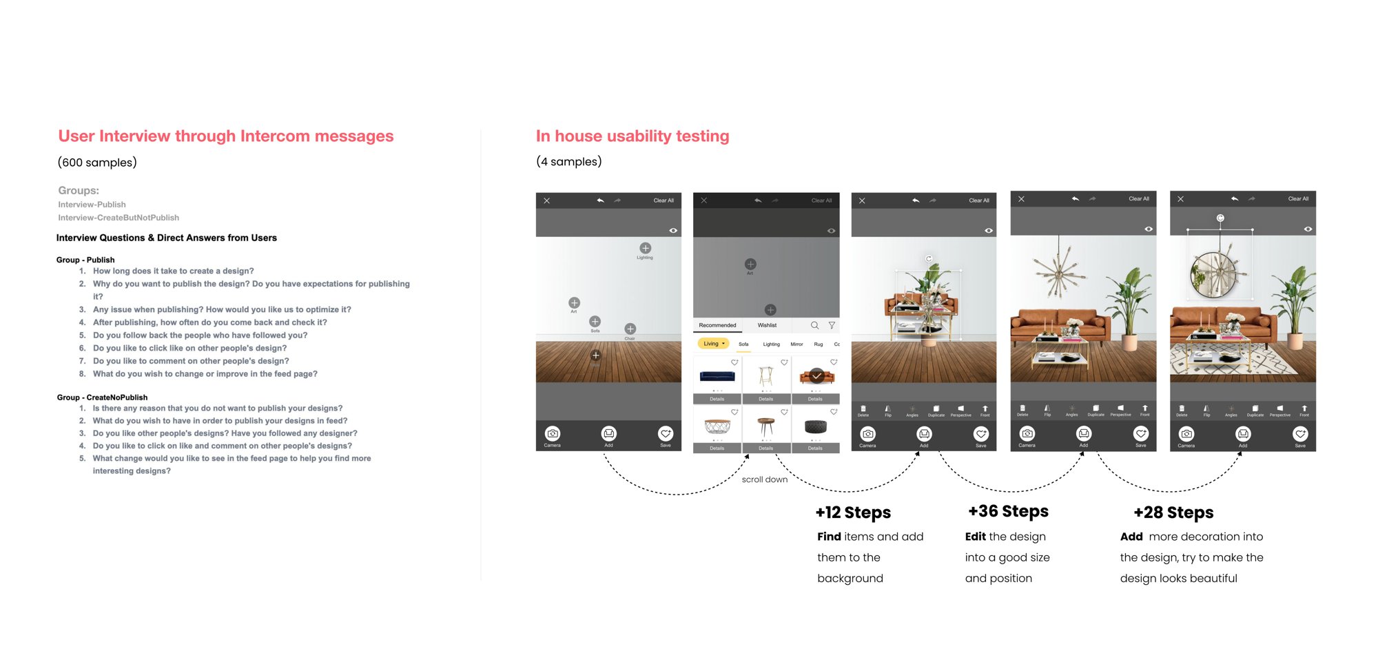
Intercom-recruited sessions with users who did publish vs. users who created but didn't. Every new flow ran through in-house usability before it shipped.
Why they didn't publish
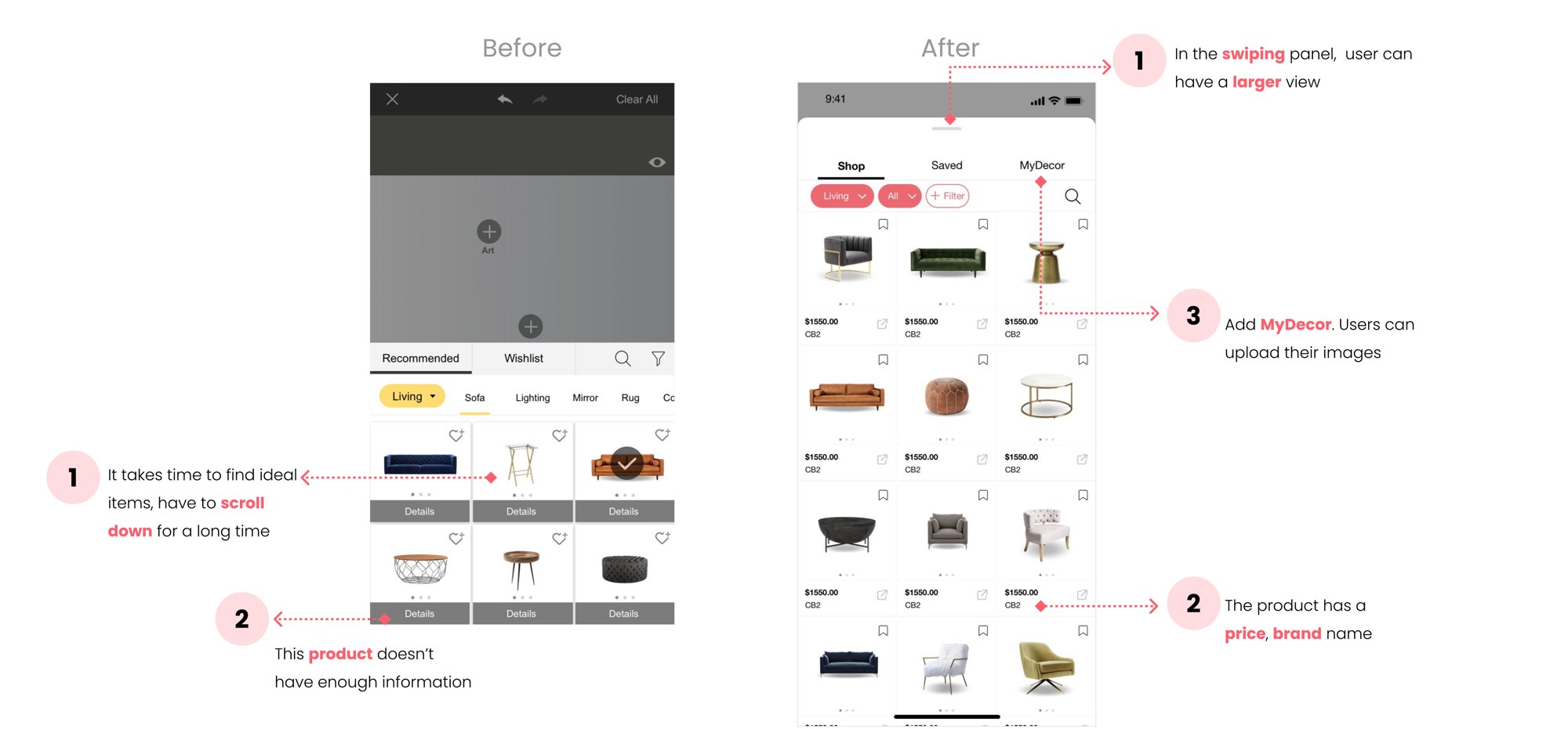
  • Endless scrolling to find ideal items.
  • Afraid no one would like the design.
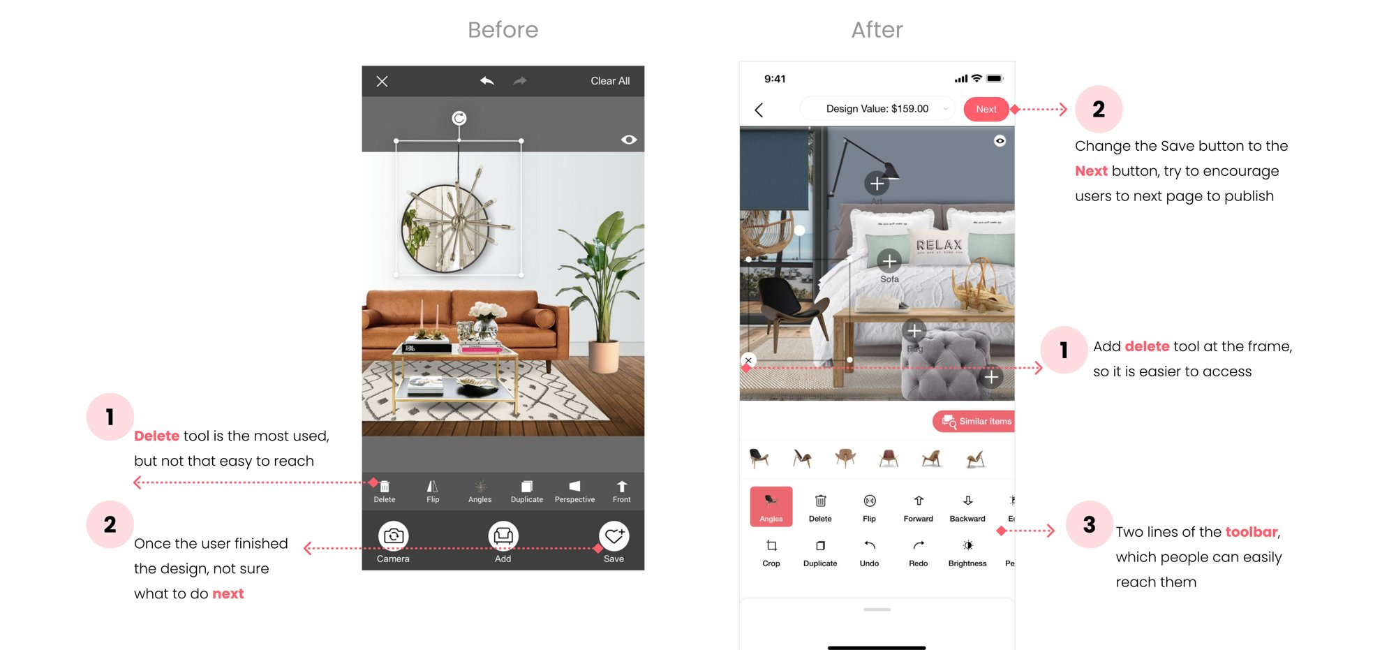
  • Delete and edit tools felt hidden.
  • Finished — and then what?
Why they did
  • I want feedback from other designers.
  • It feels good when people heart my room.
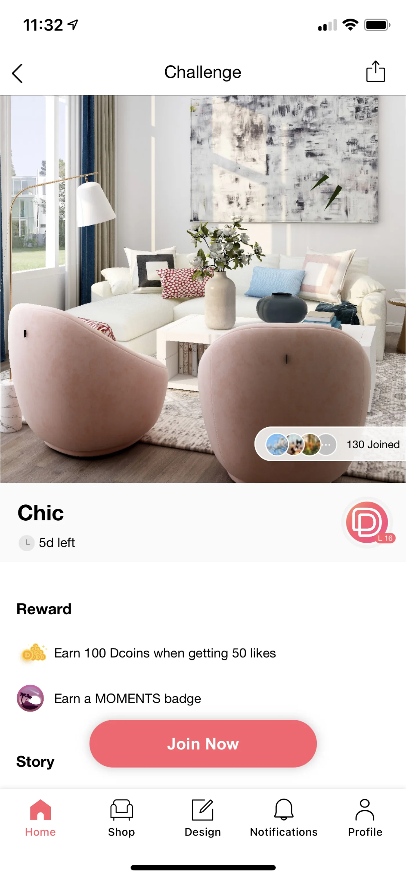
  • Challenges give me a reason to share.

Three bets

Unblock the publish button from three directions at once.

I led design on three parallel tracks — speed up item search, make tools forgiving, give publishing a reason. Each shipped as a minor release so we could measure independently.

01
Faster item search.
New filter system, recently-used row, AI-surfaced similar items. Time-to-find dropped ~45s → ~12s.
Time to find item−73%
02
Tools that forgive.
Delete moved to the frame handle. One-tap undo. A guided publish checklist replaced a confusing overflow menu.
Session completion+41%
03
A reason to publish.
Daily challenges, remix mechanics, and a "next step" card after every finished design turned publishing into the obvious move.
Publish rate×4.2
Result · after Chapter II shipped
×4.2
Designs published
×2.0
Likes per session
×1.8
Comments per design
Chapter IIIIII.

A subscription is a product. Not a business.

By 2020, MyDecor subscription drove ~75% of revenue — fragile. The goal was 2× without breaking the free creator experience. The framing shift: stop treating this as retail. Start treating it as a game economy.

DecorMatters virtual gifts for commenting — mobile UI
Virtual gifts
Gift-for-comment flow

Most comments were "beautiful / wow / awesome." We turned the compliment itself into the product — paid virtual gifts attached to designs you loved.

In-App Purchase ×4
DecorMatters daily check-in and badges — mobile UI
Daily tasks & badges
Dcoins reward system

Daily check-ins earned Dcoins; finished challenges won badges. Gamers' real needs — practice, recognition, a fun escape — became the loop that kept them opening the app.

DAU retention +38%
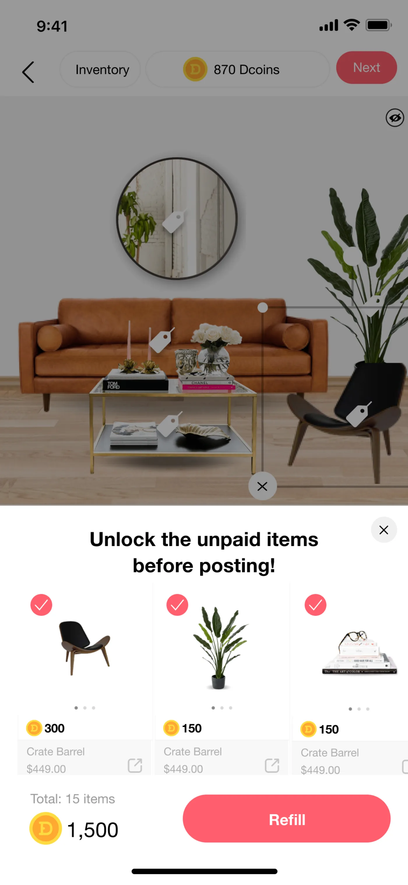
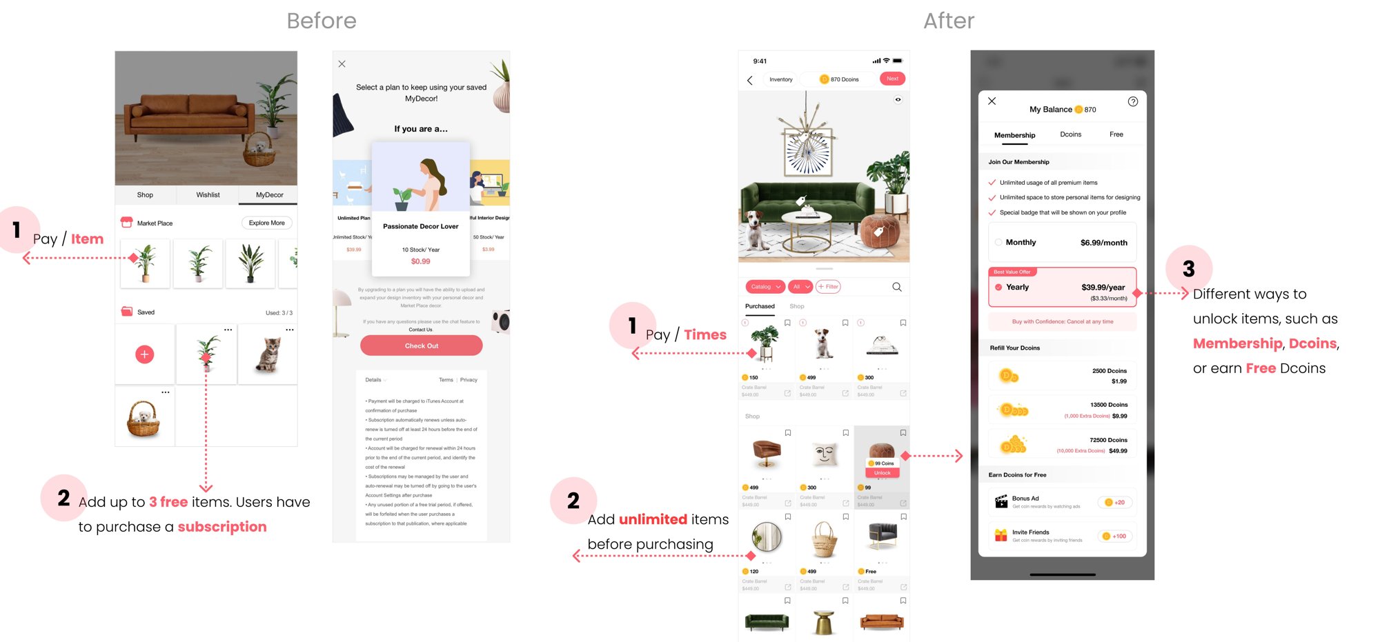
DecorMatters membership unlock and coin store — mobile UI
Membership + Dcoins
Three ways to unlock

Instead of a hard paywall, items could be unlocked three ways: membership, purchased Dcoins, or earned Dcoins. Free users kept designing. Invested users paid — or earned by showing up.

Paid conversion +2.3×
Result · after Chapter III shipped
×6.0
Revenue — 3× the 2× goal
3
Revenue streams, diversified
Coda

Four things I'd put on a poster.

Five years of DecorMatters compressed into the lessons I actually carry.

01
Validate assumptions first.
The shopping-app thesis felt obvious. It was wrong. A year of wrong is expensive — test the riskiest assumption first, always.
02
Ship small, iterate fast.
Every big release should be five minor ones. You learn more from five shipped features than one perfect launch.
03
Own idea to launch.
Design doesn't stop at the mock. Run cross-functional tracking, keep eng / PM / marketing aligned, stay in the build the whole way.
04
Be human.
Empathy and kindness go a long way — with users, teammates, candidates. It's the through-line of everything I still care about.
Back to the start
Smart List AI — the auto-listing flow
Back to work
Case Study 04 / Vibe Code · Side projects

Vibe Code
a weekend collection.

A small, ongoing collection of prototypes I build after hours with AI-assisted tools. Part sketchbook, part taste-test — this is where I figure out what new interaction patterns and tools actually want to be.

Role
Designer, prompter, builder
Cadence
Evenings & weekends
Timeline
Ongoing · 2024 — present
Tools
Claude · Cursor · v0 · Figma · Make
Live experiments AI prototypes Tiny tools Design games

Why this exists

The best way to understand a tool is to ship with it.

I started Vibe Code to keep myself honest about what AI is good at — and what it isn't. Every prototype here is a hypothesis about an interaction, a product, or a tool. Some became pitches. Some became features at work. Most just taught me something I couldn't have learned from a blog post.

Prototype 01
01
Taste Mirror — an AI stylist

Upload your closet, get outfit drafts that match your actual taste rather than a trend algorithm. Experiment in taste-modeling with LLMs.

Prototype · AI Live
Prototype 02
02
Room Remix — AR x GenAI

Photograph a room, swap walls, floors, furniture with GenAI and ship the design. An echo of DecorMatters with modern diffusion models.

Prototype · AR Live
Prototype 03
03
Tiny Briefs — pm ↔ design

A tool for PMs to write design-ready briefs in under five minutes. Templates, prompts, and structured outputs for design handoff.

Tool · Work Live
Prototype 04
04
Critique Loop — for design teams

A structured critique tool that asks better questions. Explores how AI can scaffold junior designers through senior review.

Tool · Design In progress
Prototype 05
05
Listing Coach — resale companion

A personal spin on Smart List AI — coaches independent resellers on photography, titles, and pricing without locking them into a platform.

Prototype · AI In progress
Prototype 06
06
Weekend Weather — plan-making

A tiny weekend planner that understands vibes ("something outside, low effort") rather than forecast grids. A small test in conversational UI.

Tool · Fun Live

Reflection

Vibe coding changed how I design at work. Shipping tiny prototypes made me sharper at scoping, faster at prompting, and more opinionated about when AI should disappear into a product versus announce itself. The best ones usually disappear.

Back to the start
Smart List AI — the auto-listing flow